Overview
This post will be quite minimal as it’s really just a signpost to an interactive app that I have created to expo the value of joining the open data described in posts 1, 2 & 3. The app is intended to help people find out what has been going on in rivers around the UK. As stated in the caveat in the app’s ‘About’ tab, The app is not an operational tool at all. It is an MVP hackathon-style exploration of how the opendatasets might come together into something greater than the sum of it’s parts.
If the Epic’ of these posts is to promote the interest in (and publishing of) opendata relating to river networks, then perhaps the app is one ‘user story’ along the lines of : as a <open water swimmer>, I want <to explore what has been discharged into the river upstream from me> so that <I can understand what I might be swimming in>’.
The app allows the users to select areas (based on water company boundaries) , click on a map to find the nearest watercourse and then explore what’s been discharged into the rivers upstream of that point. It highlights the sections of rivers between the point of interest and any discharges, and tabulates information about the discharge points en-route. Click here to have a play and explore rivers near you.
Note I have published the app via shiny.io and is currently under a free plan. This allows me to explore, play and publish, but restricts the app footprint (and hence has made me make some design decisions to make the app fit rather than be as complete as I maybe would’ve preferred) and will limit the number of hours per month that this app will be available (24hrs up-time per month in any period. The app will be temporarily unavailable once the up-time has been exceeded).
Where next?
I’m not sure where to go from here regarding openrivers data. I have lots of ideas on how to improve the data itself (for example, to cleanse, summarise more correctly), and plenty of ideas for the interface including new visuals, options and improvements that I would like to add to the app. However, I’m not going to develop it further here as I feel it time to explore something new.
The app
The rest of this post has been copied verbatim from the ‘About’ tab on the app. I have included it in this post as a more static record of what the app looks like. Given I have opted to only host the app for free on the wonderful service provided by shiny.io the app may not always be available.
Purpose
This app is an exploration of how one might check what’s been discharged into a river. You can click on maps and the app will search upstream and summarise any known discharges that have happened around a specific date. The app has two modes:
Near real-time: When linked to the Thames Water API, it checks for discharges that were either running on a specified date, or were running up to 48 hours prior to that date.
Historic: When linked to data published by the EA from 2020-2021 for all water companies in England and Wales it will check for any discharges during the entire 12 months of interest.
Disclaimer
This app is NOT a production system. It has not been checked against the real-world for veracity. It is an exploration of interactions between open data datasets.
DO NOT make any decisions on water quality in rivers or river loadings, or river connectivity solely based on the information shown in this app. This app is published “as-is” without support or warranty. It has been published to expo open data and explore what is possible when open datasets are joined together.
Welcome
OK… now I’ve got the disclaimer off my chest, I can describe this app… It is an interactive extension to a number of posts on opendata datasets I’ve already explored in this blog:
Part 1 of the series explored an open data-set on Event Discharge Monitors (EDMs) recently made accessible by Thames Water.
Part 2 of the series explored data on English river levels and flows from the UK Environment Agency (EA)
Part 3 of the series explored the rivers themselves made available from: OS Open Rivers - data.gov.uk.
This app
This app brings the three datasets together in a mock-up of an application to help people assess the quality of water in the rivers near them.
I say “mock-up” because:
Data quality: I have only implemented some simple data cleansing. The blog posts on each dataset explore some of the issues that may be required to be addressed in an operational system. I’m just trying to explore and expo these datasets in this series, so I have chosen to tolerate aspects of data quality that might need further work in an operational environment.
completeness of rivers dataset: The river dataset is excellent, however some very small tributaries are not included (for how this manifests, see limitation 4. tracing upstream EDMs)
connectivity of rivers dataset: Some of rivers appears to be disjointed. Part 3 of my blog gives an example of what appears to be broken connectivity between the Thames and the River Lee (aka “River Lea”). For how this manifests, see limitation 4. tracing upstream EDMs. Many of discontinuities appear at real breakpoints in the flow of watercourses such as weirs. Domain expertise is essential to correctly interpret how to handle such structures. In this app I have augmented the river network to include connections between outlets & sources that are closer than 75 meters. While this is a naive step and may not be correct, it will tend to allow ‘optimistic’ tracing upstream i.e. it will search across these extra connections ‘optimistically’ presuming the water can flow along the connections and hence allow tracing to EDMs that might be connected to the section of river from which you searched. It certainly makes sense for parts of Thames water.
snapping EDMs to rivers: There area few ways in which the EDMs could be snapped to rivers. In this app I have chosen to snap EDMs to nearest sections of rivers (based on location). In areas where limitation 1 is significant the “snap to nearest” technique could snap to the wrong river.
tracing upstream EDMs: tracing relies heavily on items 1, 2 & 3.
Only Thames Water has publishes near real-time EDM data, and some EDMs are offline: This imposes some pretty fundamental limitations on the app. Note: To make the app more interesting, I’ve extended the geographic reach of the EDM information in the app by also including a historical dataset made available via the Environment Agency (see here for more information)
In any case… Read the disclaimer!
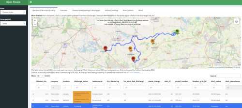
The app has a sidebar and three main tabs besides this one (Upstream EDM Interactive Map, River Systems and River Loadings), each of which are described a little below:
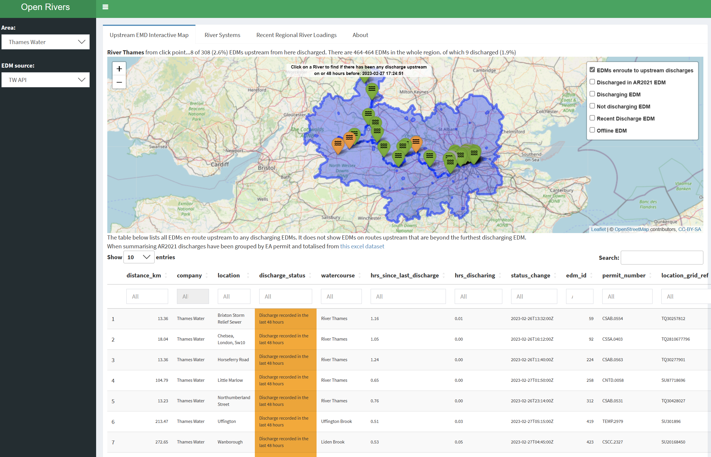
Upstream EDM Interactive Map
The map at the top of the Upstream EDM Interactive Map tab is focussed on (and restricted to) the region you’ve selected in the sidebar. The map is interactive, you can zoom and pan around. You can click on the map to select parts of rivers to explore. When you click, the map will draw a yellow line to the nearest watercourse. It will then search up-stream for any evidence of recent discharge. If any recent discharges can be traced to upstream of the section of river you’ve selected it will:
highlight the path from you selection to recent discharges.
add markers for all EDMs en-route, including those that are offline and not discharging. Each marker can be hovered over to explore details like the name, status, distance upstream etc.
Update a short summary above the map with some statistics on the part of the river you selected such as the number of EDMs discharging upstream.
it will also update a table beneath the map listing off information about the EDMs en-route to those that discharged ‘recently’. The table is interactive, you can sort and search by various columns.
An example of the screen is shown below:
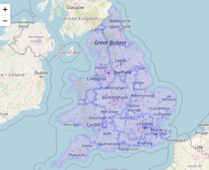
Overview
The Upstream EDM Interactive Map tab limits the search for rivers and EDMs to the borders of trhe area selected in the sidebar. This tab contains an overview map showing the boundaries of all available areas. hover over an area to see the name of the Water Company.
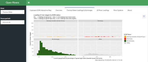
Thames Water Loadings & Discharges
The plots in this section summarise river-level data from stages maintained and published by the EA. The visual shows the river levels in the context of historic high and low levels and hence gives some indication of how full the rivers were at the time when the data was collected.
These plots are like those shown in the ‘all river loadings’ tab, but these also include the status of EDM monitors closest to the EA water level indicators. Because currently only Thames Water allows access to near-realtime EDM status indicators, these plots only show river levels in the Thames Water region. There is one plot for each kind of EDM status at the time of collection. The image below shows data for 9th March 2023 when rain & snow had begun to fall after a very dry February. Most EDMs are not discharging (shown as green), and most of the river levels associated with EDMs that are not disharging are relatively low. There are a few EDMs discharging (shown as red), and the stretches of river associated with the EDMs are a broad mix of low to high. The stretches of river where EDMs are offline (shown as grey) look like they are drawn from roughly the same distribution as the rest so do not suggest the offline ones introduce bias in the main messaging set-out by the Thames Water EDM monitors that are reporting a status.
All River Loadings
The plots in this section were originally created in blog post 2. They summarise river-level data from stages maintained and published by the EA. This visual shows the river levels in the context of historic high and low levels and hence gives some indication of how full the rivers were at the time when the data was collected. The image below is a summary taken in late Feb 2023 during a remarkably dry period. The histograms are left-of-centre (showing that most river levels are nearer their historic lows than highs), and positively skewed (more lumpy on the left hand side with a long tail towards high levels, showing that a few rivers are quite full)

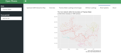
River Systems
The river systems tab is an homage to the graphics I generated in part 3 of the opendata posts. The map is an illustration of the connectivity of the rivers within the boundary of the water company selected in the sidebar. Rivers that are connected in some way share the same colour. This map is both pretty and useful. It is a good way to sense-check the topology of the river-network that is traced in the interactive map. aside: this visualisation has highlighted a few places where the connectivity of the river dataset is questionable (see blog post 3 for more details).
For the coders
This app is entirely written in R using the awesome R-Studio IDE and uses shiny to allow interactivity. It is published via shiny.io and is currently under a free plan. This allows me to explore play and publish, but restricts the app footprint (and hence has made me make some design decisions to make the app fit rather than be as complete as I maybe would’ve preferred) and will limit the number of hours per month that this app will be available.