Open data (part two): Flood Monitoring real-time data from the EA
code
analysis
EA
opendata
Author
Leo Kiernan
Published
February 9, 2023
(updated 24th March 2023 to include an extra expo of the vast amounts of historic data available from the EA, see Section 7.2 )
Overview of this post
In this post I am going to explore an open data-set source from the UK Environment Agency (EA). The source is very rich and includes measurements of water levels and flows, and information on the monitoring stations providing those measurements along with other information. This post follows on from Part 1 of this series which explored another open dataset relating to what is going in to UK rivers. As per part 1: This blog is only here to highlight the existence of the open-data services and as a ‘hello world’ example for getting started analysing them using R.
In this blog I want to:
Explore an API data service provided by the EA.
Understand the structure and content of the data provided through the service.
… So that I can…
Promote it’s use by interested parties.
Generate some insight.
and in future blogs, join these data to other datasets given that the dataset in this blog contains information on river levels and flows across the UK and the dataset from part 1 of this series contains information on when storm discharge (a mixture of rainwater and untreated sewage) is released by storm overflows into UK rivers & watercourses. It will be interesting to see if there is a way to combine these datasets and generate new insight, remembering the fact that this series of posts is primarily about exposing, exploring and espousing open data.
The dataset accessible from the EA API will allow me to create maps, plot river levels, summarize loading of rivers at catchment levels and more. I hope you enjoy this post.
Background to the EA open dataset
The Environment Agency protects and enhances the environment with responsibilities across England including:
Regulation of major industry and waste.
Water quality and water resources.
Inland river navigation, and managing the risk of flooding from main rivers, reservoirs, estuaries and the sea.
To support delivery of it’s responsibilities, the EA maintains sensors across the UK. These sensors measure things such as water level and flow-rates in rivers. There are strong links between these data and the open dataset relating to storm overflows explored in part 1 of this series.1
The EA have published an API access to near real-time flood monitoring data for a few years (click here for documentation on the EA flood monitoring API) . At the time of writing, the service is still beta but it is mature and in my opinion, an excellent example of publishing open-data based on linked data.
Note: In this post I’ve got code-folding on. This is because there is more data (and hence code) than in Part 1. I’d like to try to focus on the description of the EA API and exploration of the datasets rather than how I did it. The how is still here in the post, it’s just ‘folded’. You can unfold / expand the code sections to see the detail at any point and collapse them again if you’d rather revert to words and images.
Step 0: Load some libraries
First there’s the obligatory step of loading the libraries that I’ll be using throughout this post:
Code
library(tidyverse) # this blog uses the tidyverselibrary(lubridate) # I'm sure lubridate has been added to the tidyverse, old habits die hardlibrary(httr) # we will use this to collect data from the internetlibrary(sf) # I'm going to plot some maps. sf helps with any spatial stufflibrary(leaflet) # I like the interactivity of leaflet, but there are many other packages to plot maps.library(progress) # for feedback on progress during any long data downloadslibrary(htmltools) # I'll use this to customise some tables in the codelibrary(tidyjson) # the edivalent of tidyr for json objects (returned from URLs)
Step 1: Collect some data from the EA API
The EA API is quite sophisticated in that it has many different end-points serving different aspects of their dataverse as a whole. The EA documentation on the realtime flood-monitoring API is very good. The API can serve (return) the data from end-points in number of formats including json, csv, html, rdf and ttl (those last two provide a hint that the EA API is underpinned by linked-data). I’ll be gathering json and will defer the reader to code-comments for the detail of what the code itself is doing to collect the data. At a high level, the subset of the EA data I’ll be collecting relates to rivers and is structured as follows:
Stations: There are a number of stations distributed across the UK (uid: station_id). The kinds of data associated with stations include geolocation, name, catchment, date opened, statistics on historic high and low water levels 2 etc).
Measures: Each Station houses one-or-more sensors recording measures (uid: measure_id). The kind of data associated with measures includes the name of the measure, the SI units of the measure, measurement interval etc…
Measurements: Each measure records a time-series made up of date-time, value pairs termed measurements.
Wrap the low-level / reused stuff in a function
In order to make collecting this data more coherent, I’ve written some functions. I hope the comments are sufficient for the coders to see what I’m doing, and the interested reader can copy & run this code and inspect the values of the variables at each step of each pipeline:
Code
#' @title collect_items_from_url#'#' @description#' This function wraps a httr::GET with some error handling & formatting. when the dplyr::bind_rows fails it will#' revers to do.call rbind which will still return a dataframe but#' the dataframe will have lost it's natural types and all be chr#'#' @return the "items" payload as a dataframe#'#' @export#'#' @examples#' collect_items_from_url("https://environment.data.gov.uk/flood-monitoring/id/measures/1491TH-level-stage-i-15_min-mASD/readings?since=2023-02-07T00:00:00Z")#'collect_items_from_url <-function(url) { res <- httr::GET(url = url)if (httr::status_code(res) !=200){warning(paste("Ateempted GET from: ", url))warning(paste("Request failed with status code: ", httr::status_code(res))) result <-NULL } else { content <- httr::content(res) result <-tryCatch( { dplyr::bind_rows(content$items) },error =function(cond) {warning("using do.call backup conversion for DF")#| Sometimes the standard (bind_rows) option:#| data <- dplyr::bind_rows(content$items)#| fails because one record has two values#| (and hence must be a list rather than a numeric)do.call(rbind, content$items) %>%as_tibble() %>%mutate(across(everything(), as.character)) %>%# drop one of the duplicate values# (I'm not sure it's suppose to be here# in these cases anyway)na.omit() } ) }return(result)}#' @title load_ea_data#'#' @description#' This function collect info on all available EA stations.#'#' @return a list of three dataframes#' 1. ea_stations_sf#' 2. ea_station_measurements#' 3. ea_latest_readings#'#' @export#'#' @examples#' load_ea_data()#'load_ea_data <-function() {#| I'm going to create 3 datasets#| 1. a table of stations (including locations etc)#| 2. a table of measurements (including units and a link to the station)#| 3. a table of current values associated with these measurements# http://environment.data.gov.uk/flood-monitoring/doc/reference# 1. load the station data:message("loading EA station data") res <- httr::GET(url ="http://environment.data.gov.uk/flood-monitoring/id/stations?_view=full") json_payload_with <- httr::content(res)$items# note: I'm also making this a geospatial DF, and by doing so# I will lose a few station records . this is fine by me as I'm mapping them# but for other uses one might be intersted in *all* the stationsmessage("creating station table") ea_stations_sf <- json_payload_with %>%spread_all() %>%as_tibble() %>% janitor::clean_names() %>%rename(station_id = id) %>%mutate_at(vars(contains("date")), lubridate::as_datetime) %>%filter(!is.na(easting)) %>%# remove any that can be geo-located# the EA attribute both east&north AND lat, long# each set of coords comes from a different Coordinate Reference System (CRS)# the CRS for east&north is 27700, the CRS for latlong is 4326# I'm choosing to use the easting & northing (units are in metres)st_as_sf(coords =c("easting", "northing"),crs =27700,remove = F) %>%# I want to keep the easting & northingrename(geom = geometry) # My standard name for geometries is "geom"#| 2. EA extract station measurements ----#| stations can have many measurements#| so unnest the details of each measurementmessage("creating measurements table") ea_station_measurements <- json_payload_with %>% spread_all %>%select(station_id ='@id') %>%# keep the station Id, it's the foreign keyenter_object(measures) %>%gather_array() %>%spread_all() %>%as_tibble() %>% janitor::clean_names() %>%rename(measure_id = id) # measure_id is the primary key for measures#| 3. EA get the latest readings available ----#| get a latest data for all sensors#| (new GET request, differnt URL)message("collecting currrent measurements") ea_latest_raw <-collect_items_from_url(url ="http://environment.data.gov.uk/flood-monitoring/data/readings?latest") %>%mutate(dateTime = lubridate::as_datetime(dateTime)) %>%mutate(value =as.double(value))# make the data you want to see in the worldmessage("creating current values table") ea_latest_readings <- ea_latest_raw %>% janitor::clean_names() %>%rename(measure_id = measure) %>%rename(measurement_id = id) %>%left_join(ea_station_measurements %>%select(measure_id, unit_name))#| I'm returning all three dataframes as a list#| There's lots of way to handle this and perhaps this insnt#| as normalised as it could be, but I've chosen to do it like this#| You could write two or three separate routines to collect#| each kind of data,#| Or represent the stations & measurements (paired) datasets#| differently (say have the measurements nested inside the#| stations records)#| This is "just" a blog, so I'm not over-thinking the alternativesmessage("creating a list containing all three EA dataframes") result <-list("ea_stations_sf"= ea_stations_sf,"ea_station_measurements"= ea_station_measurements,"ea_latest_readings"= ea_latest_readings)message("load_ea_data: done")return(result)}# ASIDE: I used gpttools (which called chatGPT) to generate the roxygen comments#' @title asHTML#'#' @description#' This function takes a character string and adds the "html" class and "html" attribute.#'#' @param text a character string#'#' @return a character string with the "html" class and "html" attribute#'#' @export#'#' @examples#' asHTML("<p>This is a paragraph</p>")#'asHTML <-function(text){#| this helper function will be useful when I#| define the content of labels that are diplayed#| when the mouse hovers on a monitor in the leaflet map attr(text, "html") <-TRUEclass(text) <-c("html", "character")return(text)}
Call the functions to download the EA data
With the data-import logic all nicely wrapped into functions I can load the data with a few lines of code:
Code
# its worth remembering when we collected the data as it could change each time we collect it:data_collection_dt <-Sys.time()# load the data -----ea_dfs <-load_ea_data()
Aside: loading some details on water company boundaries
While writing this post, I was not entirely sure whether to include this step here because I’m trying to introduce a set of open data-sources (separately) in a series of posts, and then bring them together in subsequent ones. However, the dataset on Water Company boundaries3 doesn’t warrant a post of it’s own, but will help to bring colour and context to the EA dataset, so lets load it here now and have a look at the resultant map4:
Code
#| Stack exchange once again makes it easy to make reproducible code#| https://stackoverflow.com/questions/64850643/why-cant-i-get-st-read-to-open-a-shapefile-from-a-compressed-file-map-is-readread_shape_URL <-function(URL){ cur_tempfile <-tempfile()download.file(url = URL, destfile = cur_tempfile) out_directory <-tempfile()unzip(cur_tempfile, exdir = out_directory) sf::read_sf(dsn = out_directory) #read_sf also works here st_read}wc_bundaries_sf <-read_shape_URL("https://data.parliament.uk/resources/constituencystatistics/water/SewerageServicesAreas_incNAVsv1_4.zip") %>%rename(geom = geometry) %>%# we don't need the full resolution here, save a few Mb# by simplifying to a tolerance of 10 meters because we're in CRS 27700st_simplify(dTolerance =10)wc_bundaries_sf %>%st_transform(crs =st_crs(4326)) %>%leaflet() %>%addProviderTiles(providers$CartoDB.Positron) %>%addPolygons(label =~asHTML(paste0(COMPANY)))
Step 2: Explore & transform the data
It’s always worth taking time to get to know your data. While writing this post I’ve iterated a few times in exploring, plotting, inspecting and adapting the datasets. For illustration, lets explore what measures are available at stations:
Code
# here's a list of the possible measurements (and their units)ea_dfs$ea_station_measurements %>%count(parameter_name, qualifier, unit_name, sort = T) %>% DT::datatable(filter ='top') %>%# https://stackoverflow.com/questions/31921238/shrink-dtdatatableoutput-sizediv(style ="font-size: 75%")
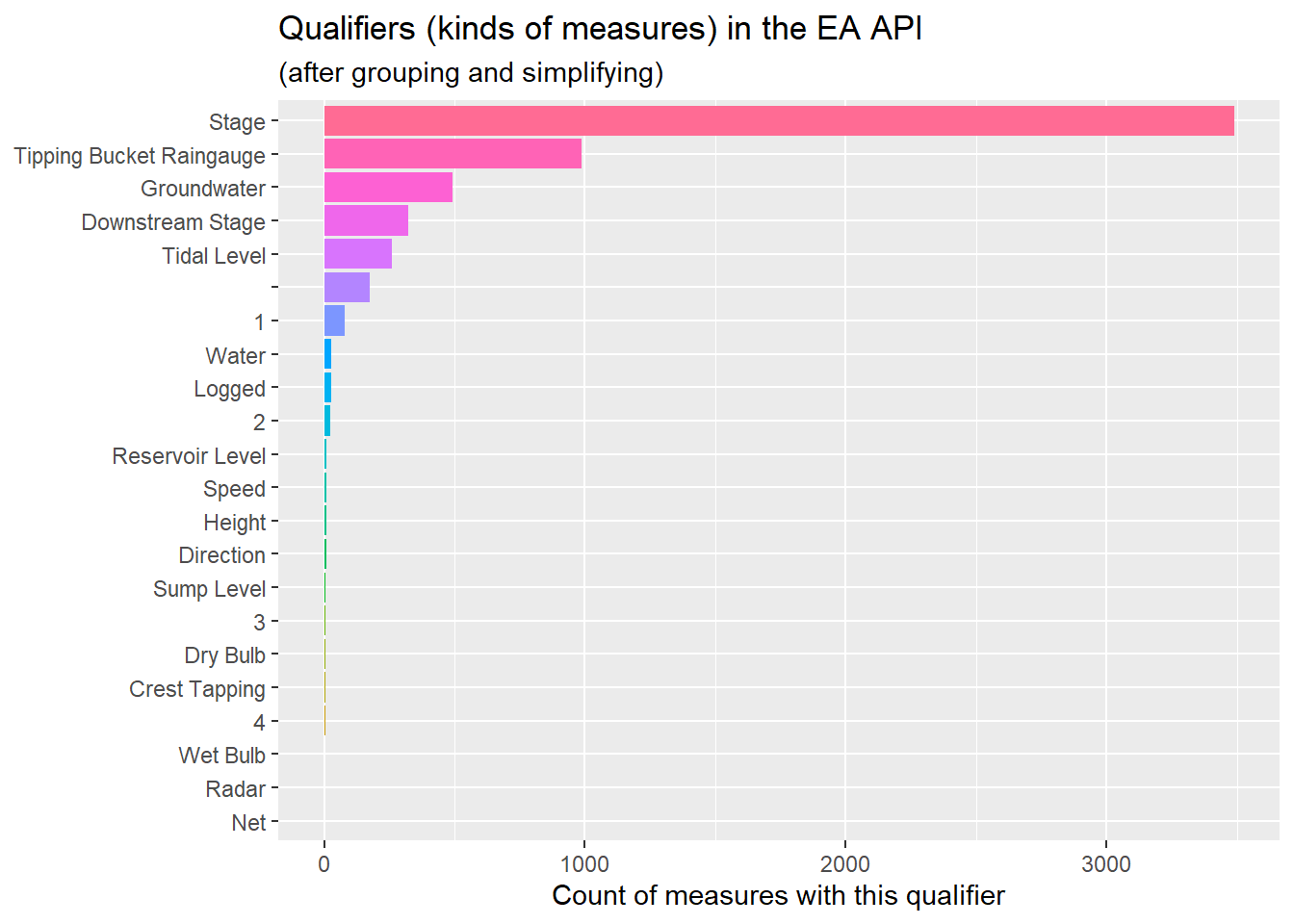
The parameter_name and qualifier describe what is being measured (at high & detailed levels respectively). There appears to be a range of units even for one type of parameter_name:qualifier pair. There are lots of certain kinds of measurements and far fewer of others.
Diving more deeply into the qualifiers:
Code
ea_dfs$ea_station_measurements %>%count(qualifier, sort = T) %>%mutate(qualifier =fct_reorder(qualifier, n)) %>%ggplot() +geom_bar(aes(qualifier,n, fill = qualifier),stat ="identity", show.legend = F) +# geom_bar(aes(mosaic_desc,n_props, fill = mum, group = mum), stat = "identity") +coord_flip() +labs(title ="Qualifiers (kinds of measures) in the EA API",subtitle ="(after grouping and simplifying)",x =NULL,y ="Count of measures with this qualifier")
Something is weird here…The top few (most frequent) qualifiers look sensible (even if I’m not sure what they mean), but after “Tidal Level” there are blanks and numbers among the other relatively rare but sensible looking qualifiers.
Digging deeper into one of the measures with a strange qualifier… it’s not something I’ve accidentally done to the data to corrupt it (always worth checking). An example of a measure with qualifier = “1” can be found here. So lets make a judgement call and cleanse the data-frame such that it’s more usable by keeping only the top 5 kinds of qualifier and lumping all others into a group called “Other”…
Code
#| Note: It's bad practice to do this here#| It's especially bad practice to overwrite a variable#| as it makes reproducibility difficult#| what I *Should* be doing is to go back to the function#| that I wrote to load the data and put this code in there#| but if I did that...#| The journey I'd gone on wile exploring the data wouldnt#| be as clear to the reader, so I'm leaving it here in this blogea_dfs$ea_station_measurements <- ea_dfs$ea_station_measurements %>%# count(qualifier, sort = T) %>%na.omit() %>%mutate(qualifier =as_factor(qualifier)) %>%mutate(qualifier = forcats::fct_drop(qualifier)) %>%mutate(qualifier =fct_lump(qualifier, n =5))
Let’s have another look at the cleansed dataset… It seems much simpler and cleaner without having thrown away too much information (note: I have thrown away some interesting sounding classes of measurement (“speed”, Reservoir level”, Sump level, Dry Bulb etc.) but there weren’t many of them and I’m being quite brutal in this post about what I’m trying to show.
Code
# note: we're throwing away some interesting sounding classes of measurement ("speed", Reservoir level", Sump level, Dry Bulb etc.)ea_dfs$ea_station_measurements %>%count(qualifier, sort = T) %>%mutate(qualifier =fct_reorder(qualifier, n)) %>%ggplot() +geom_bar(aes(qualifier,n, fill = qualifier),stat ="identity", show.legend = F) +# geom_bar(aes(mosaic_desc,n_props, fill = mum, group = mum), stat = "identity") +coord_flip() +labs(title ="Qualifiers (kinds of measures) in the EA API",subtitle ="(after grouping and simplifying)",x =NULL,y ="Count of measures with this qualifier")
Step 3: Visualise
Now we’ve loaded the EA datasets and the water company boundaries we could do some exploratory visualisations…
An interactive map showing EA stations from the API
The map shown below is interactive (leaflet) map. hint: try the following:
Zoom in and out to see more detail.
Pan around by click&hold then moving the mouse.
Use the radio buttons to toggle between different types of measurements and see which stations they are available from.
Hover over the markers to see some detail about the station and measure.
Click on a marker and then follow either the station or measurement URL to see the underlying data that the EA API returns from the URLs.
Note: The above map displays data from whenever this blog was last refreshed, so the measurement values may be quite old if this blog is still being read some time in the future… It’s very easy to create apps that pull data at some interval or when a button is pressed. In R I would use use shiny, but there are equivalent frameworks in Python, Javascript etc.
Step 4: Summarise
River loading statistics
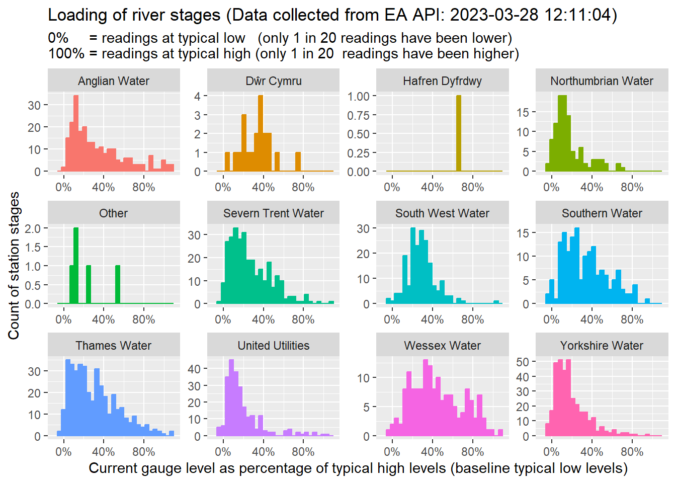
The value of open-data is that it empowers exploration and innovation. If you have access to the data, then you can begin to create new insights. Perhaps it would be interesting to merge a few of the data-frames and calculate a measure of how heavily loaded the rivers are currently (using data from ea_dfs\(ea_latest_readings) compared to historic extremes (using data from ea_dfs\)ea_historic_stage_ranges) .
The code in this section does the following:
First the data-frames are joined (using inner_joins so that stations without ranges are automatically filtered out)
the code then calculates a ‘percent of typical high’ measure. The measure gives some indication of the load on the river. It is normalized (between typical low & typical high) such it can be averaged across different stations and rivers. For illustration:
A value near 100% would represent very high water levels (near 1-in-20 high water levels)
A value near 0% would be represent very low water levels (near those low levels only seen 5% of the time)
{r create the data you want to see in the world, warning=F, message=F}
Once the data has been prepared we can visualize is across a number of stations to check the general loading of rivers. In the plot below I have joined the dataset to the maps of the water company boundaries so that I can generate a plot for each water company and compare the relative stress levels of rivers in each water company.
Note: there are lots of water companies (some of which serve a number of different geographies), so I’ve chosen to limit the number shown to only the largest by geographic area…
{r plot histograms of percent loading on stages, warning=FALSE, message=FALSE}
p<- ea_dfs$ea_stats %>% st_join(wc_bundaries_sf %>% select(AreaServed, COMPANY) %>% filter(st_area(geom) > units::set_units(10e8, m^2) )) %>% #| Some measurements fall outside the boundaries of the big WACs #| the can convert NA to “Other” (more readable) using coalesce() mutate(COMPANY = coalesce(COMPANY, “Other”)) %>% as_tibble() %>% ggplot() + geom_histogram(aes(x = pct_typical_high, colour = COMPANY, fill = COMPANY), show.legend = FALSE) + scale_x_continuous(labels = scales::percent, limits = c(-0.1, 1.1)) + facet_wrap(~ COMPANY, scales = “free”) + labs(title = paste0(“Loading of river stages (Data collected from EA API:”, data_collection_dt, “)”), subtitle = paste0(“0% = readings at typical low (only 1 in 20 readings have been lower)% = readings at typical high (only 1 in 20 readings have been higher)”), x = “Current gauge level as percentage of typical high levels (baseline typical low levels)”, y = “Count of station stages”)
p
In the above plot, I have tried to highlight the loading of the rivers within the boundaries of the largest water companies. What I observe from these plots includes:
This visualisation has potential to be practically useful. There’s a lot of information condensed into this plot. Once familiar with the plot the reader can very quickly see how heavily loaded the river networks are for any particular company (as the “hump” of the histogram moves to the right of the plot when the river network does become heavily loaded). Also, its very easy to see how many measures are contributing to the assessment of load.
The EA dataset doesn’t cover all of the rivers in all of of the largest water companies. There’s only a few available for the Welsh Companies. The EA dataset for river levels is focused on stations in England even if there are tidal measurements around the entire GB mainland. The extent of the availability of gauge level measurements can be explored in the interactive map from Section 6.1 by selecting the ‘gauge’ radio-button option.
Some measurements look strange… Some measurements can report current values above both the typical and max_on_record or below the min_on_record. I do not have time to explore this further in this post, but it’s another example of the rabbit-holes that should be explored when cleansing data and understanding how to use a dataset properly. I’m presuming here that the data is wrong rather than my interpretation of it, but I could well have overlooked something about this dataset and be misusing or misinterpreting it as a result.
Collecting time-series data from the EA-API
The EA have provided a range of ways to collect data from their measurement stations. Up until this point I have only been investigating the current value for each measurement. Because this is a common use-case
Current data: as described in the EA API documentation under the section: notes on crawling:
‘A common requirement is for an application to maintain a copy of all the latest level or flow values from some (or all) of the measurement stations. The efficient way to do this is to issue this single call every 15 mins: http://environment.data.gov.uk/flood-monitoring/data/readings?latest. This will retrieve the latest value for all measurements - from which you can pick the ones you are interested. Since the data changes at most every 15 mins then this single call four times an hour will ensure a complete track of all of the data. This is much preferable to crawling all the stations every 15 mins picking up a single latest value for each station one at a time. However, this is not sufficient to maintain a complete historical trace since readings are sometimes updated in batches. For that purpose a query for the relevant station readings using the since filter is appropriate.’
Recent Data (up to about 6 weeks old): The EA API endpoint for stations and measurements allows collection of data since some date. as per the section above, this is a good way to collect a contiguous historical trace for a particular station. However, the since option only allows collection of data up to about 6 weeks old. If you want to collect older data, The EA pride access to archives (see below)
Historic data (any historical data): The EA also provides daily dumps of measurement data. Their excelent documentation notes: ‘Measurement readings are archived daily as dump files in CSV format. Both the short form and the _view=full form are available. The data is available from http://environment.data.gov.uk/flood-monitoring/archive with individual archives being at http://environment.data.gov.uk/flood-monitoring/archive/readings-{full-}{date}.csv.’
In the following two sections I explore the recent and historic data as they each present their own distinct opportunities and challenges.
Collecting recent data (many days at once for each measurement)
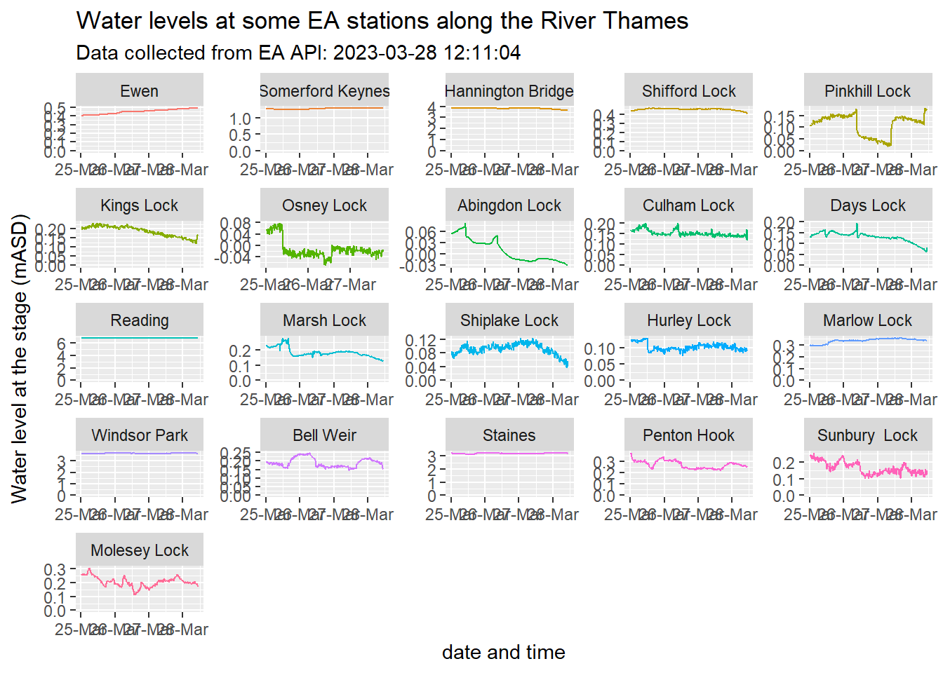
We can ask the API to return recent values recorded for measurements (up to about 6 weeks ago) using the /readings endpoint. In the code below I gather time series for gauge levels from 21 EA stations along the River Thames. I’m also protecting myself from any potential confusion in units by only selecting measures with units mASD5.
Code
#| I'm setting a seed to the sample_n gives me back#| # a consistent set of time series#| (as I'll refere to them in the text)set.seed(037) ea_dfs$ea_sample_timeseries <- ea_dfs$ea_stations_sf %>%filter(river_name =="River Thames") %>%inner_join( ea_dfs$ea_station_measurements %>%filter(qualifier =="Stage"& unit_name =="mASD") ) %>%sample_n(21) %>%mutate(historic_url =paste0(measure_id, "/readings?since=",as.Date(data_collection_dt -days(3))),.before =1) %>%select(station_id, river_name, parameter_name, qualifier, unit_name, label, easting, measure_id, historic_url) %>%#| this next line calls:#| collect_items_from_url(historic_url) #| for each row of the input dataframe#| and adds a new variable (the dataframe timseries) to "readings"mutate(readings =map(historic_url, collect_items_from_url)) %>%# we can expand / flatten the nested dataframe by calling unnestunnest(readings)
We’ve collected data from these points along the River Thames:
Code
ea_dfs$ea_sample_timeseries %>%# select just one of the values (we're plotting where, not what)# and where doesnt change over timegroup_by(station_id, measure_id) %>%sample_n(1) %>%# leaflet uses lat-long, so convert to the new CRS projection sf::st_transform(crs = sf::st_crs(4326)) %>%# not load the map...leaflet() %>%addProviderTiles(providers$CartoDB.Positron) %>%addAwesomeMarkers(group =~qualifier,label =~asHTML(paste0('<b>', label, '</b><br>', river_name, '<br>', parameter_name, ":", qualifier, '<br>')),popup =~asHTML(paste0('Hyperlinks:<br>',"<b><a href='", station_id, "'target=_blank>Station URL</a></b>", '<br>',"<b><a href='", measure_id, "'target=_blank>Measure URL</a></b>") ) )
The plots of the stage-levels at each of the locks is shown below.
Note: I’ve ordered the facets according to how far east the station is. Scanning left-right, top-bottom on the plots is the same as scanning left-to right in the map. This should make it reasonably easy to cross reference where the measure is taken from (the above map) and what the levels of water levels have been doing (the time-series plots below) at the stage (the stage is upstream of any lock).
Code
ea_dfs$ea_sample_timeseries %>%mutate(dateTime = lubridate::as_datetime(dateTime)) %>%mutate(label =as_factor(label)) %>%mutate(label =fct_reorder(label, easting)) %>%ggplot() +geom_line(aes(x = dateTime, y = value, colour = label),show.legend = F) +expand_limits(y =0) +scale_x_datetime(#limits = c(time.start, time.end),breaks = scales::date_breaks("1 day"),labels = scales::date_format("%d-%b") ) +facet_wrap(~ label, scales ="free") +labs(title ="Water levels at some EA stations along the River Thames",subtitle =paste0("Data collected from EA API: ", data_collection_dt),x ="date and time",y ="Water level at the stage (mASD)")
Perhaps it’s worth considering a few characteristics of the above plots:
I’m ordering the facets such that the stations are listed across & down according to how far downstream they are. (I’m ordering them along the river in an easterly direction). Stations further to the bottom right are further east, and hence down-stream and closer to the sea.
The stations towards the bottom right may have their levels affected by the tide.
The time-series for each plot has “now” at the extreme right-hand-side. So if these plots were repeatedly refreshed on new data (say once every 15 minutes), the humps and bumps would slowly scroll to the left as new data was poked in at the right. This helps with the following observation…
Because of the ordering, any surges in river level due to rainfall up-stream may propagate downstream over time, so there may be a lagged correlation between station stage levels from left-to-right and top-to-bottom of the facets. For example: the time-series for Pinkhill, Kings and Osney locks have very similar shapes, but time-shifted.
Collecting Historic data (many measurements at once for each day)
Warning: As we’ve already seen, the EA manage and publish data from a lot of measurements on a lot of stations. Each csv of historic daily data is about 56 Mb and includes flow, levels, rainfall and all other sensor data available from the API.
Big(ish) data
Because I’m writing this post as part of a series that includes storm event discharge open-data (see post 1), I would like to compare Thames Water discharges against rainfall and river levels in the Thames region. The rain and river level datasets are only a fraction of the whole EA dataset, and the Thames Water region is only a fraction of the entire geography managed by the EA. However, because the structure of the archives is daily archives for all data for everywhere, extracting data for even a single measurement for a year would require all 365 daily CSVs (each with a payload of 56Mb) , or about 20Gb of data.
On the bright side, if we could collect and find a way to process this volume of data, the download would be only one hit on the EA API (at least, one large sequence of hits) on the EA API. Any subsequent alternative investigations could be done locally as all the data for all the measurements would be at hand. The downside is that 20Gb is quite a lot of data to slice and dice and may not even fit in memory of a modest modern computer. If we were to analyse these data using (say) Python or R, common libraries like Pandas and polars (for Python), dplyr (for R), or data.table (for R and Python) risk failing catastrophically with “out of memory” errors. At the time of writing, I’m lucky enough to have a machine with 16Gb of RAM, and the 20Gb CSVs just about squeezes in to memory if I used data.table, however, the loading process come quite close to exceeding physical memory, so I have considered alternatives:
Break the problem down: “Q: How do you eat an elephant? A: One bite at a time :-)”… I could chose to handle each day csv iteratively, extracting only what I need and storing it elsewhere so that the “what & where” subsetting (and possibly even a daily summarisation) can be done before all the days are stacked end-to-end and analysed or plotted.
Bring in some big-gun analytics: We’re in the age of big-data, there are a range of options I could employ if I wanted to eat the whole elephant…
Technologies like SPARK have been developed to deliver data engineering & analytics in a scalable & elastic way (i.e. to seamlessly allow almost arbitrarily large data to be distributed across many computers making analytics tasks tractable.
Other alternatives might be to put the data into client-server databases (PostgreSQL being my favourite FOSS version, but other systems like Influx tuned for timeseries are also available). These can be distributed, but even on single machines employ some high-end computer science to handle data efficiently.
I have chosen to use duckDB in this instance. My rationale was partly curiosity (I’ve been following their successes for some time but have never had a decent reason to dive in until now), and partly practical (I now need larger-than-memory data manipulation). I’m very familiar with postgreSQL (and SQL in general), and duckDB has received a lot of kudos and attention in analytics communities lately as a simple and n DB for analytics. The duckDB website holds a wealth of detail but is neatly summarised as having: “All the benefits of a database, none of the hassle”. It’s simple and sits neatly in the “bigger-than-memory analytics” space and works from Python, R, Java, Node.js, C++, Julia and ODBC SQL.
Lets get quacking (sorry, I couldn’t resist)
At there highest level, I’m going to have to go through the following steps:
Collect the CSV archive datasets from the EA API
Import the data into the analytics system (duckDB)
big(ish) data processing and analysis, simplifying and distilling down into consumable chunks.
summarise and visualise the (no longer big-ish) data
I thought once or twice about including this here, but I hope I can keep far enough out of the detail to maintain the focus on the EA data rather than the technologies I’m using to provide my answers.
Historic data analysis step 1: collect the data from the EA API
This is “simply” a case of iterating over each date for which I want to collect the data, calling the URL and storing the results somewhere safe. I’ve commented out the code below, only so that it’s not run each time I publish this blog. It took about 1hour 10 mins to download all 352 CSVs (it’s not quite 365 days since 2022-04-01).
Code
#| this code "Map"s a list of dates onto download.file.#| "Map can be thought of as a loop. it's the same as:#| for (this_date in (list of dates) {#| create URL of csv from "https://envi[...]archive/readings-" & this_date#| download the file from the URL into the local directory defined by csv_path#| }#| I've defined my own csv_path, it's not relevant to this post#| NOTE#| IK've commented out the code.#| I dont want to collect all the data every time I publish this post!if(FALSE) {Map(function(i) { f =str_c("https://environment.data.gov.uk/flood-monitoring/archive/readings-", i, ".csv")download.file(f, destfile =str_c(csv_path, basename(f))) }, seq.Date(from = from_date,to = to_date,by = by_date) )# this took 1hr 12min to get all 352 56Gb csvs}
Historic data analysis step 2: load all the CSVs into duckDB
The process of loading the CSVs into duckDB is very simple (see folded code if you’re interested)
Code
# Note: this path only works on my config:duck_path <-"C:/Users/leoki/DATA/EA/duckDB/duckDB_EA"#| loading all 352 files takes:#| user system elapsed #| 139.19 28.58 288.86 #| .#| This code:#| 1) gets a list of CSVs that can be loaded (as per previous code chunk)#| 2) establishes a connection to a (new) duckDB database#| 3) #| NOTE#| I've commented out the code.#| I dont want to collect all the data every time I publish this post!if(FALSE) {Sys.setenv(DUCKDB_NO_THREADS =8)# get a list of files tro import.... files =dir(path = csv_path, pattern ="csv$", full.names = T)# establish a connection to a (new) duckDB database... con <-dbConnect(duckdb(duck_path))# create a new table called "ea_measurements"# and finally itterate over all the files, copying them into the table print(system.time({dbExecute(con, "CREATE TABLE ea_measurements(dateTime TIMESTAMP,measure VARCHAR(100),value DOUBLE);")for(f in files) { q =sprintf("COPY ea_measurements FROM '%s' ( IGNORE_ERRORS TRUE );", f)dbExecute(con, q) } }))}
I also push another table into duckDB. This is a dataset that provides context to the measurement values. I chose to do this so that I will be able to slice by type of measurement and location inside duckDB , thereby making the most of the efficiencies and larger-than-memory analytics capabilities.
Code
if(FALSE) {# add another from and R DF# dbExecute(con, "DROP TABLE ea_station_measurements")dbWriteTable(con, "ea_station_measurements", ea_dfs$ea_station_measurements %>%mutate(short_measure =basename(measure_id)) %>%rename(measure = measure_id) %>%inner_join( ea_dfs$ea_stations_sf %>%as_tibble() %>%select(station_id, label, river_name, lat, long) ),overwrite =TRUE )}
Historic data analysis step 3: extract some summaries
All the historic CSVs have now been loaded into the database. The DB can be queried (very quickly and efficiently) by opening a connection to the database:
Code
library(DBI)library(duckdb)# establish a connection to a (new) duckDB database...con <-dbConnect(duckdb(duck_path))# when you're done, you can close the connection as follows# DBI::dbDisconnect(con)
and then the database can be queries using standard SQL syntax:
Code
tictoc::tic()y <-dbSendQuery(con, "SELECT COUNT(*) FROM ea_measurements;")dbFetch(y)
count_star()
1 160090087
Code
tictoc::toc()
0.05 sec elapsed
As that simple query showed, I’m now processing over 160 million records. DuckDB allows analysis of vast quantities of data quickly and efficiently. The code below extracts daily summary of a subset of rainfall and river level and returns the results for on-analysis.
Code
library(dplyr)library(dbplyr)# get handles to the tables into the databaseea_mmt_tbl <-tbl(con, "ea_measurements") # the timeseries dataea_stnmmt_tbl <-tbl(con, "ea_station_measurements") # context for the timeseriesea_daily_readings_rain <- ea_mmt_tbl %>%# select(-measure) %>%inner_join( ea_stnmmt_tbl %>%filter((lat >51.3) & (lat <51.6)) %>%# a corridow a bit like the thamesselect(measure, river_name, parameter_name, qualifier, unit_name) %>%filter(unit_name =="mm") %>%filter(qualifier =="Tipping Bucket Raingauge") %>%filter(parameter_name =="Rainfall") ) %>%mutate(dt =as.Date(dateTime)) %>%filter(!is.nan(value)) %>%group_by(dt, measure, parameter_name, qualifier, unit_name) %>%summarise(value =mean(value, na.rm = T)) %>%# show_query()ungroup() %>%collect()ea_daily_readings_stage <- ea_mmt_tbl %>%# select(-measure) %>%inner_join( ea_stnmmt_tbl %>%filter((lat >51.3) & (lat <51.6)) %>%# a corridor a bit like the thamesselect(measure, river_name, parameter_name, qualifier, unit_name) %>%# filter(river_name == "River Thames") # %>% head(5) # only get data for 10 places along the thamesfilter(qualifier =="Stage") %>%filter(unit_name =="mASD") ) %>%mutate(dt =as.Date(dateTime)) %>%group_by(dt, measure, parameter_name, qualifier, unit_name) %>%filter(!is.nan(value)) %>%summarise(value =mean(value, na.rm = T)) %>%ungroup() %>%collect()# 11.92 seconds
Note: The code I wrote above is a “pipeline” of data-manipulation in dplyr syntax. Some of my favourite aspects of using d(b)plyr is that:
d(b)plyr is very readable (each data processing “verb” such as “filter” and “select” is almost self-explanatory)
pipelines (that weird-looking ‘%>%’) make for the steps in some data processing task read like a recipe… Steps in a pipeline are separated with a “%>%” which you can just read as “then”. So the recipe inside a pipeline reads like: “dothis, then do that, then …”
The analysis is “lazy”, which just means that it will only process data if and when it needs to. Until the point when the data is actually needed the code just builds up a set of instructions (or recipe). at the point of execution there can be significant optimisation of how the instructions are implemented. In the previous example, the data is not really needed until I called “collect”, which returns the results into my session. At the point of collection I have sub-setted the data geographically and by measurements type and I have summarise the sub-day data into daily averages so the memory overhead of calculating the result is considerably smaller than it would have been otherwise. In this case I have processed and joined what was once 20Gb of CSVs using less than 2Gb of memory in under 12 seconds.
A particularly attractive feature is that the instructions can be presented as RDBMS style SQL query. In fact, in dbplyr, this is exactly how the requests of a pipeline are parcelled up and sent to databases. The process is rock-solid, even though the queries generated from pipelines can become quite sophisticated. The SQL that was executed by the previous pipeline is shown below:
Code
ea_mmt_tbl %>%# select(-measure) %>%inner_join( ea_stnmmt_tbl %>%filter((lat >51.3) & (lat <51.6)) %>%# a corridor a bit like the thamesselect(measure, river_name, parameter_name, qualifier, unit_name) %>%# filter(river_name == "River Thames") # %>% head(5) # only get data for 10 places along the thamesfilter(qualifier =="Stage") %>%filter(unit_name =="mASD") ) %>%mutate(dt =as.Date(dateTime)) %>%group_by(dt, measure, parameter_name, qualifier, unit_name) %>%filter(!is.nan(value)) %>%summarise(value =mean(value, na.rm = T)) %>%ungroup() %>%show_query()
<SQL>
SELECT
dt,
measure,
parameter_name,
qualifier,
unit_name,
AVG("value") AS "value"
FROM (
SELECT *, CAST(dateTime AS DATE) AS dt
FROM (
SELECT ea_measurements.*, river_name, parameter_name, qualifier, unit_name
FROM ea_measurements
INNER JOIN (
SELECT measure, river_name, parameter_name, qualifier, unit_name
FROM ea_station_measurements
WHERE
((lat > 51.3) AND (lat < 51.6)) AND
(qualifier = 'Stage') AND
(unit_name = 'mASD')
) RHS
ON (ea_measurements.measure = RHS.measure)
) q01
WHERE (NOT(("value" IS NOT NULL AND PRINTF('%f', "value") = 'nan')))
) q02
GROUP BY dt, measure, parameter_name, qualifier, unit_name
It’s good practice to disconnect from the database when we’re finished with it (as shown below).
Code
DBI::dbDisconnect(con)
Historic data analysis step 4: visualising the time-series
Now we can plot or analyse the time-series data however we want. In the graph below I’ve plotted a daily summary of median gauge levels and rainfall measurements, but there is a huge amount of insight waiting the historic datasets.
Code
p <- ea_daily_readings_stage %>%mutate(measure =basename(measure)) %>%group_by(dt) %>%summarise(stage_level_m =median(value, na.rm = T)) %>%inner_join( ea_daily_readings_rain %>%mutate(measure =basename(measure)) %>%group_by(dt) %>%summarise(rain_mm =median(value, na.rm = T)) ) %>%pivot_longer(c(stage_level_m, rain_mm), names_to ="measurand", values_to ="reading") %>%ggplot() +geom_line(aes(x = dt, y = reading, colour = measurand)) +labs(title ="Historic rainfall and river levels", subtitle ="EA data filtered and summarised", caption ="data from EA historic archives", x ="date", y ="")plotly::ggplotly(p)
The plot shown above is interactive, hover over some of the spikes in rainfall (there’s an obvious one on the 2023-03-08), then hover over the corresponding spike in river levels. There looks to be a lag of approximately a day or two between heavy rain and peak flows in rivers.
Summarising river loadings by water company
River loading statistics
The value of open-data is that it empowers exploration and innovation. If you have access to the data, then you can begin to create new insights. Perhaps it would be interesting to merge a few of the data-frames and calculate a measure of how heavily loaded the rivers are currently (using data from ea_dfs$ea_latest_readings) compared to historic extremes (using data from ea_dfs$ea_historic_stage_ranges) .
The code in this section does the following:
First the data-frames are joined (using inner_joins so that stations without ranges are automatically filtered out)
the code then calculates a ‘percent of typical high’ measure. The measure gives some indication of the load on the river. It is normalized (between typical low & typical high) such it can be averaged across different stations and rivers. For illustration:
A value near 100% would represent very high water levels (near 1-in-20 high water levels)
A value near 0% would be represent very low water levels (near those low levels only seen 5% of the time)
Once the data has been prepared we can visualize is across a number of stations to check the general loading of rivers. In the plot below I have joined the dataset to the maps of the water company boundaries so that I can generate a plot for each water company and compare the relative stress levels of rivers in each water company.
Note: there are lots of water companies (some of which serve a number of different geographies), so I’ve chosen to limit the number shown to only the largest by geographic area…
Code
p<- ea_dfs$ea_stats %>%st_join(wc_bundaries_sf %>%select(AreaServed, COMPANY) %>%filter(st_area(geom) > units::set_units(10e8, m^2) )) %>%#| Some measurements fall outside the boundaries of the big WACs#| the can convert NA to "Other" (more readable) using coalesce()mutate(COMPANY =coalesce(COMPANY, "Other")) %>%as_tibble() %>%ggplot() +geom_histogram(aes(x = pct_typical_high, colour = COMPANY, fill = COMPANY), show.legend =FALSE) +scale_x_continuous(labels = scales::percent, limits =c(-0.1, 1.1)) +facet_wrap(~ COMPANY, scales ="free") +labs(title =paste0("Loading of river stages (Data collected from EA API: ", data_collection_dt, ")"),subtitle =paste0("0% = readings at typical low (only 1 in 20 readings have been lower)\n100% = readings at typical high (only 1 in 20 readings have been higher)"),x ="Current gauge level as percentage of typical high levels (baseline typical low levels)",y ="Count of station stages")p
`stat_bin()` using `bins = 30`. Pick better value with `binwidth`.
In the above plot, I have tried to highlight the loading of the rivers within the boundaries of the largest water companies. What I observe from these plots includes:
This visualisation has potential to be practically useful. There’s a lot of information condensed into this plot. Once familiar with the plot the reader can very quickly see how heavily loaded the river networks are for any particular company (as the “hump” of the histogram moves to the right of the plot when the river network does become heavily loaded). Also, its very easy to see how many measures are contributing to the assessment of load.
The EA dataset doesn’t cover all of the rivers in all of of the largest water companies. There’s only a few available for the Welsh Companies. The EA dataset for river levels is focused on stations in England even if there are tidal measurements around the entire GB mainland. The extent of the availability of gauge level measurements can be explored in the interactive map from Section 6.1 by selecting the ‘gauge’ radio-button option.
Some measurements look strange… Some measurements can report current values above both the typical and max_on_record or below the min_on_record. I do not have time to explore this further in this post, but it’s another example of the rabbit-holes that should be explored when cleansing data and understanding how to use a dataset properly. I’m presuming here that the data is wrong rather than my interpretation of it, but I could well have overlooked something about this dataset and be misusing or misinterpreting it as a result.
Summary
In this post I’ve explored open data made available by the UK Environment agency. I’ve only really scratched the surface of this resource, but hopefully I’ve:
shown how to collect and visualise live data
shown where to look for, and how to handle much larger archives of historic data
alluded to how this data could prove useful when joined with other sources of open-data
Where next?
It’s over to you to continue exploration of the data and to find ways to visualize, summarize and generate insight. The EA has made a very useful set of data available through a great API. I hope this post has been interesting. I look forward to other people’s apps, posts and summaries of this valuable open data-set.
Personally, I will be continuing to explore this data and joining it to other open data-sets, but that is for another post…
Footnotes
Storm overflows are regulated by the Environment Agency. Storm discharges are legally allowed, under the conditions of the Environment Agency permit.↩︎
Historic high and low levels are logically associated with measures (as measures generate measurements, which, in turn have historic high and low values. Since version 0.7 of the API, the ’?_view=full’ of stations includes a range of statistics about the stage (water level) measures. The statistics include the lowest / highest values ever read and the 5th and 95th percentiles. Later in this post, the ranges of historic values for measures will prove very useful when contextualising current river levels.↩︎
The water company boundaries are published from a number of sources. In this post I’ll load them from here: https://data.parliament.uk/resources/constituencystatistics/water/SewerageServicesAreas_incNAVsv1_4.zip↩︎
While loading the Water Company map data, I simplified the shapes to a tolerance of 10 metres (st_simplify). I have done this because I don’t really need all the detail for this blog, and it saves a lot of space when the map is simplified a little. The simplification may make the water company boundaries look a little strange on the maps when zoomed-in to the finest detail.↩︎
The EA API documentation highlights that typical values are mAOD (for metres relative to the Ordnance Survey datum), mASD (for metres relative to the local stage datum), m (for metres with an unspecified datum).↩︎